Presentation layer includes gui development, presentation logic and data retrieval logic. In this chapter all this topics will be described.
OpenSwing allows gui development based on several solutions: thare are no constraints on graphics controls usage inside the applications. It can be possible to create applications based on javax.swing.JFrame and/or javax.swing.JInternalFrame classes.
In addition, OpenSwing framework provides some generic components that can be adopted to realize applications based on an MDI front-end (Multiple Document Interface).
An MDI environment is available with OpenSwing; this feature is based on org.openswing.swing.mdi. client.MDIFrame class. This class represents the main application window (derived form JFrame); inside it user can show internal frames, based on org.openswing.swing.mdi.client.InternalFrame class (derived from JInternalFrame).
|
The interface org.openswing.swing.mdi.client.MDIController is passed as argument to MDIFrame class and it is used to define the MDI frame behaviour; the interface declares the following methods:
|
|
MDIFrame class is a singleton class: it can be directly called from any client-side place, by means of MDIFrame.getInstance() static method.
To access to ClientFacade implementation class there exist a method in MDIFrame: getClientFacade() ; this method can be invoked from any client-side place.
To add internal frames to the MDI frame there exist a method in MDIFrame: add() ; this method is available in two versions: the first requires only one argument, the internal frame; the last requires the internal frame and a flag indicating if the internal frame must be maximized.
All internal frames added to MDI frame must extend org.openswing.swing.mdi.client.InternalFrame class.
Each time ad internal frame is added to MDIFrame class, its name is also added to "Window" menu and a button is added also to buttons panel in the bottom of the MDI frame (if this showing setting is enabled); by means of the menu item in "Window" menu related to the internal frame, used can move to front the internal frame or by clicking on the corresponding button in the buttons panel.
There are many properties in InternalFrame class: using them it i possible to create for instance modal internal frames, a unique instance of an internal frame, adding automatic save changes checking before closing it, etc.
All base graphics controls, grid, tree, Form, lookup provided with OpenSwing can be used also without the MDI frame, i.e. without org.openswing.swing.mdi.client package usage. In this case all features linked to the MDIFrame class cannot be used (tree menu, menu bar, window menu, buttons panel, progress bar, etc).
OpenSwing provides many base graphics controls. All these graphics controls implements the same interface: org.openswing.swing.client.InputControl that declares some common properties:
In the following table are reported all base graphics controls.
Graphics control |
Description |
Text label
|
org.openswing.swing.client.LabelControl Text label is automatically translate according to internationalizatin settings currently setted. |
Multi-line text label
|
org.openswing.swing.client.MultiLineLabelControl Multi-line text label, whose text is automatically translated according to internationalizatin settings currently setted. |
Text input field
|
org.openswing.swing.client.TextControl Text input field has several additional properties: • "maxCharacters" maximum number of characters allowed • "trimText" define if text must be trimmed, i.e. if spaces characters at the left and on the right of text must be removed • "upperCase" define if text is always expressed in uppercase • "rpadding" define if must be applied right padding on the text (additional spaces added on the right of the text until the text length is exactly uquals to "maxCharacters"); this property is useful when the graphics control is linked to a database field of type CHAR. |
Multi-line text input field
|
org.openswing.swing.client.TextAreaControl This input field has one additional property: "maxCharactes" that defines the maximum number of characters allowed. |
Numeric field
|
org.openswing.swing.client.NumericControl Numeric input field has several additional properties: • "maxCharacters" - maximum number of characters allowed • "maxValue" maximum number allowed • "minValue" minimum number allowed • "decimals" maximim number of decimals • "grouping" define if thousand symbol must be showed |
Currency field
|
org.openswing.swing.client.CurrencyControl This control extends NumericControl class, therefore it inherits all its properties, besides the followings:
Currency, decimal and thousand symbols are always visible. |
Date + calendar input field
|
org.openswing.swing.client.DateControl Date+calendar input field has several additional properties:
To preset the date control content to the current date value, it can be used the shortcut key F1 (when the cursor is inside the date control). |
Combo-box
|
org.openswing.swing.client.ComboBoxControl The content of a combo-box control is defined starting from a domain (se domains paragraph). This input field has several additional properties:
|
Check-box
|
org.openswing.swing.client.CheckBoxControl Check-box control has the additional property "text" indicating the (optional) text that must be showed on the right of the check-box. "allowNullValue" property allows to add to check-box a third optional state: null,
i.e a check box can be selected, deselected and set to null. |
Radio-button
|
org.openswing.swing.client.RadioButtonControl Radio button control has the additional property "text" indicating the (optional) text that must be showed on the right of the radio button. |
Image control
|
org.openswing.swing.client.ImageControl This control is a panel composed of (i) an image panel (classe org.openswing.swing.client.ImageControl . ImagePanel ), i.e. a scrollpane that shows an image and (ii) a button (optional) used to select an image from the local file system and show it in the image panel. This input field has several additional properties:
ImageControl provides a utility method that can be used to listen ActionEvents fired by the selection button: public void addActionListener(ActionListener listener) by means of this method it is possible to capture the event of image selection: the property ActionCommand of ActionEvent argument contains the selected image path. ImageControl is based on ImagePanel component. This component can be directly used instead of ImageControl if there is no need to link the image to a Form object. ImagePanel provides some utility methods:
|
FormattedTextControl
|
org.openswing.swing.client.FormattedTextControl A wrapper of javax.swing.JFormattedTextField. See Swing Javadoc about JFormattedTextField for more information. |
ListControl
|
org.openswing.swing.client.ListControl This component is a wrapper of a JList component and provides the same utility methods of JList. A mandatory property of ListControl is the domain identifier, used to show as list items the domain's descriptions; when an item is selected the related domain code is returned. The value of the attribute can be of any type (e.g. a Java data type, such as String, BigDecimal, etc) or could be a java.util.List that contains any data type, according to the list selection mode: ListSelectionModel.SINGLE_SELECTION_INTERVAL or another, respectively. |
CheckBoxListControl
|
org.openswing.swing.client.CheckBoxListControl This component is a wrapper of a JList component and provides the same utility methods of JList. Moreover, for each item is showed a check-box too, in order to select multiple items by selecting check-boxes. A mandatory property of CheckBoxListControl is the domain identifier, used to show as list items the domain's descriptions; when an item is selected the related domain code is returned. The value of the attribute can be of any type (e.g. a Java data type, such as String, BigDecimal, etc) or could be a java.util.List that contains any data type, according to the list selection mode: ListSelectionModel.SINGLE_SELECTION_INTERVAL or another, respectively. |
Password input field
|
org.openswing.swing.client.PasswordControl Password input field has several additional properties:
|
Progress bar control
|
org.openswing.swing.client.ProgressBarControl This field is a read only control that shows a progress bar; it provides several additional properties:
The latter method is used when a programmer has defined some colored bands in the progress bar, through the method: public final boolean addColoredBand(double minValue, double maxValue, Color color) This method adds an interval [minValue,maxValue] and a color to use to paint that interval. |
Combo-box multi column
|
org.openswing.swing.client.ComboBoxVOControl The content of a combo-box control is defined starting from a list of value objects, retrieved through a ItemsDataLocator. More than one v.o. attributes can be mapped as combo item and these attributes can also be mapped to the container v.o. (i.e. the v.o. of the grid or of the Form). This input field has several additional properties:
This input field provides some mandatory methods that a programmer must invoke:
Moreover, the input field allows to specify which combo's v.o. attributes to use to compose an item, through the following methods:
|
List multi column
|
org.openswing.swing.client.ListVOControl The content of a list control is defined starting from a list of value objects, retrieved through a ItemsDataLocator. More than one v.o. attributes can be mapped as item and these attributes can also be mapped to the container v.o. (i.e. the v.o. of the grid or of the Form). This input field has several additional properties:
This input field provides some mandatory methods that a programmer must invoke:
Moreover, the input field allows to specify which list's v.o. attributes to use to compose an item, through the following methods:
The value of the attribute can be of any type (e.g. a Java data type, such as String, BigDecimal, etc) or could be a java.util.List that contains any data type, according to the list selection mode: ListSelectionModel.SINGLE_SELECTION_INTERVAL or another, respectively. |
Link button
|
org.openswing.swing.client.LinkButton A link, whose text can be translated according to internationalization settings. It is possible to define text color when mouse is over the link and it is possible to add an ActionListener to listen mouse clicks on the link. It provides some optional properties:
|
Spinner number
|
org.openswing.swing.client.SpinnerNumberControl A wrapper of JSpinner for numbers: it accepts a sequence of numbers, fixed an interval, an increment value and an initial value. It is possible to listen for ChangeEvents though the addChangeListener() method. It provides the following properties:
|
Spinner list
|
org.openswing.swing.client.SpinnerListControl A wrapper of JSpinner for a generic enumeration of values: it accepts a Domain object or a Domain identifier. It is possible to listen for ChangeEvents though the addChangeListener() method. It provides the following properties:
|
ClientSettings.DISABLED_INPUT_CONTROLS_ FOCUSABLE global property can be used to (do not) allow focus settings onto disabled input controls: when set to "true" all input controls (both enabled and disabled) are focusable, so also the content of a disabled control can be selected and copied; when set to "false" (default value) focus is not appliable to disable input controls, so focus will be moved only among editable components: disabled components are skipped when using TAB key to move focus.
The class org.openswing.swing.form.client.Form extends javax.swing.JPanel class, therefore it can be used as graphics controls container. This class analyzes all components inside it (including those nested within folder, splitpanes or jscrollpane added to the Form) and registers all recognized graphics controls.
Example:
|
All graphics controls recognized and registered inside the Form are liable to the same operations, applied at every operation mode change.
The Form has 3 possible operation modes: insertion, editing, read only, that are identified by the following constants: Consts.INSERT, Consts.EDIT e Consts.READONLY. To switch from a mode to another, is available the method Form.setMode() . To retrieve the current operation mode of the Form is available the method Form.getMode() .
When the Form is switched to INSERT mode, all graphics controls will be cleaned out and the ones that has "enabledOnInsert" property set to "true" are enabled too. When the Form is switched to EDIT mode, all graphics controls having "enabledOnEdit" property set to "true" are enabled. When the Form is switched to READONLY mode, all graphics controls are disabled.
Graphics controls registration is automatically performed when the Form become visible. To postpone the controls recognition/registration activity or to re-execute it, two Form methods are available :
OpenSwing provides some buttons having a definite meaning (see Buttons paragraph); these buttons can be linked to the Form, through the following Form methods:
A required property that must be set in the Form object is " functionId "; this property defines an identifier associated to the Form that the Form exploits to decide if insert/edit/delete buttons must be enabled or not when the operation mode is changed: the setEnable method of these buttons always checks if the buttons must be enabled, by verifing authorizations defined in ClientSettings for the specified functionId. In OpenSwing buttons authorizations are defined as a collection of <functionId, related buttons authorizations> and are stored inside ClientSettings object (see buttons authorization section).
A Form object represent a collector of graphics controls; all these controls share the same model: the data model linked to the Form; this data model is based on org.openswing.swing.form.model.client. VOModel class and requires a value object declaration, through the method:
public final void setVOClassName(String voClassName)
Graphics controls added to a Form object are connected to attributes of the value object by means of graphics control "attributeName" property. Note that the "attributeName" property is not mandatory: a graphics control could not have setted that property if the control is not added to a Form, but rather to a simple JPanel (or another Container object). However, if graphics control has been added to a Form, then "attributeName" property must be set: by means of this property the Form (i) can correctly fill the graphics control when data model is loaded and (ii) can retrieve from graphics control the current value on it and update the corresponding attribute of the value object.
Form object provides some methods to synchronize data model and graphics controls:
A Form object requires a controller object linked to it; the controller class must be defined by the programmer and must extends org.openswing.swing.form.client.FormController class.
Data model, Form and Controller are the tern of M-V-C pattern (Model-View-Controller), on which the controller component acts as manager of events generated by the other two components (expecially for events fired by the Form).
To connect Form and Controller the programmer must invoke the method:
public final void setFormController(FormController formController)
This class provides a few methods that can be overriden by the programmer:
By overriding this method, the programmer can exploit the value object passed as argument to carry on the saving operation.
The method requires as return value a Response object (see response messages paragraph): the programmer must return one of the following objects: ErrorResponse in case of error or VOResponse in case of saving operation correctly completed; VOResponse object must contain the value object passed in the saving request, enhanced with possibile futher data, calculated during saving operation (such as a progressive determined by accessing the database).
The Form object exploits the returned value object to re-set the data model and update graphics controls values.
Note that before calling this method, the Form has already checked all controls to verify their validity state (by invoking Form.push method): this insure that the saving operation can be executed starting from a state where all mandatory graphics controls are correctly filled. If validity check has no success, then insertRecord method is not called.
By overriding this method, the programmer could carry on the saving operation by exploiting the value object passed as argument and the initial value object, which is constructed from the record read from database before editing; the initial value object can be useful for example with web applications that are concurrently accessed: before updating the record in the database, values from the initial value object will be used to check if the record has been already changed from another client; only if the record is not yet changed, the updating operation is performed.
The method requires as return value a Response object (see response messages paragraph): the programmer must return one of the following objects: ErrorResponse in case of error or VOResponse in case of saving operation correctly completed; VOResponse object must contain the value object passed in the saving request, enhanced with possibile futher data, calculated during saving operation (such as updating data, updating user, etc.).
The Form object exploits the returned value object to re-set the data model and update graphics controls values.
Note that before calling this method, the Form has already checked all controls to verify their validity state (by invoking Form.push method): this insure that the saving operation can be executed starting from a state where all mandatory graphics controls are correctly filled. If validity check has no success, then updateRecord method is not called.
The method requires as return value a Response object (see response messages paragraph): the programmer must return one of the following objects: ErrorResponse in case of error or VOResponse in case of deleting operation correctly completed; VOResponse object must contain Boolean object, indicating the deleting result.
A programmer can override this method to insert instructions that start data loading operations for other components, such as grids or other panels not directly linked to the Form.
The Form object exploits the returned value object to re-set the data model and update graphics controls values.
The Form object provides two methods that allow to link the Form to the parent grid: in this way the binding created between grid and its detail Form allows to automatically reload data in the Form while selecting row in grid through the navigator bar. Other features are provided through these two methods:
"navBar" argument is related to the navigator bar to directly link to the Form (that must be different from the optional mavigator bar binded to the grid). This second navigator bar will fire events to the grid and, as consequence, the grid will invoke loadData method of the FormController.
"reloadModelWhenSelectingOnGrid" boolean argument allows to establish if Form loading is possible when using grid's navigator bar or only when using Form's navigator bar.
"pkAttributes" argument has another use: it forces the refresh of grid content after inserting/edit/deleting data in the Form. This HashSet must contain attribute names of the v.o. of the grid and of the Form: they are used to identify the unique row in grid having that values, i.e. to identify the row in grid related to the Form content. These feature is used for the three operations available in Form: (i) after inserting new data in the Form and saving them, a grid loading is performed to fetch only one row, the row related the the new Form data just saved. The primary key values identified by "pkAttributes" are used to fetch data for the grid by applying a filter based on that pk. The row just fetched is then appended to the grid content. (ii) after updating Form content and saving these changes, a grid loading is performed to fetch only one row, the row related the Form data just updated. The primary key values identified by "pkAttributes" are used to fetch data for the grid by applying a filter based on that pk. The row just fetched is then used to replace the old row in the grid whose content has been changed by the updating operation on the Form. (iii) ) after deleting Form content, the row related the Form data just deleted is identified and removed from the grid.
Thanks to this mechanism, it is no more needed to reload the entire content of the grid each time the Form is used to insert/update data (grid reloading was not a good solution because sorting and/or filtering conditions applied to grid could hide the new/updated rows being processed through the Form).
Demo4 sample shows how to link grid control to the Form.
OpenSwing provides some buttons that assume a predefined meaning, having a standard behaviour if they are connected to grid or Form; these buttons are located in the package org.openswing.swing.client
Button |
Description |
Insert button
|
org.openswing.swing.client.InsertButton it should be connected to a grid or Form; when pressed, it disables itself and the edit, delete and copy buttons; it also enables save and reload buttons. A shortcut is associated to the button: CTRL+I. |
Copy button
|
org.openswing.swing.client.CopyButton - it should be connected to a grid or Form; when pressed, it disables itself and the edit, delete and insert buttons; it also enables save and reload buttons. A shortcut is associated to the button: CTRL+C. |
Edit button
|
org.openswing.swing.client.EditButton - it should be connected to a grid or Form; when pressed, it disables itself and the insert, delete and copy buttons; it also enables save and reload buttons. A shortcut is associated to the button: CTRL+E. |
Reload button
|
org.openswing.swing.client.ReloadButton - it should be connected to a grid or Form; when pressed, it disables the save button and enables the edit, delete, insert and copy buttons if they was initially enabled. A shortcut is associated to the button: CTRL+Z. |
Save button
|
org.openswing.swing.client.SaveButton - it should be connected to a grid or Form; when pressed, it disables itself (only if saving operation was correcly completed) and enables the edit, delete, insert and copy buttons if they was initially enabled. A shortcut is associated to the button: CTRL+S. |
Delete button
|
org.openswing.swing.client.DeleteButton - it should be connected to a grid or Form; when pressed, it perform the deleting operation. A shortcut is associated to the button: CTRL+D. |
Date export button
|
org.openswing.swing.client.ExportButton it should be connected to a grid to export in Excel/csv/XML/HTML/PDF/RTF format the whole resultset associated to the grid. A shortcut is associated to the button: CTRL+X. |
Date import button
|
org.openswing.swing.client.ImportButton it should be connected to a grid to import record to grid from a document having Excel/csv format. A shortcut is associated to the button: CTRL+M. |
Filtering/Sorting button
|
org.openswing.swing.client.FilterButton it should be connected to a grid; when pressed, it shows a dialog window that allows to define filtering and sorting conditions that must be apply to grid. A shortcut is associated to the button: CTRL+F. |
Navigation bar
|
org.openswing.swing.client.NavigatorBar it should be connected to a grid to move the selected row in grid: at the beginning of the resultset, one page backward, one row before, one row after, one page forwards and at the end of the resultset, respectively. If it is connected to a Form panel, then it fires events to the grid and, as consequence of the grid to Form binding, also the Form content will be reloaded according to the new selected row in grid. It is possible to hide page buttons by setting the property ClientSettings.SHOW_PAGINATION_BUTTONS_ON_NAVBAR to false. |
Generic button |
org.openswing.swing.client.GenericButton a programmer can create any number of generic buttons having a specified image and link them to a grid or to a Form object. In this case the abilitation state of the generic buttons will be defined by the operation mode of the grid/Form. When the grid/Form switches to read only mode then the connected generic buttons will be enabled; if the grid/Form switches to insert/edit modes then the connected generic buttons will be disabled, to the purpose of avoiding to open child windows or to execute custom logics activated through the buttons when the grid/Form is currently being modified. |
All buttons described above can show an image, an image and a text or only a text. This behavior can be defined through ClientSettings.BUTTON_BEHAVIOR global property.
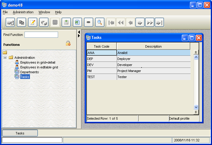
OpenSwing provides org.openswing.swing. mdi.client.DefaultToolBar class that is a special panel that includes all buttons described above: it is possible to initialize ClientSettings.MDI_TOOLBAR global property in order to add a unique toolbar at the top of the MDI environment and manage this toolbar by all internal frame components. A programmer can bind a GridControl or a Form panel to that toolbar, by using instructions such as:
grid.setInsertButton(ClientSettings.MDI_TOOLBAR.getInsertButton());
for each toolbar button to bind to the specific grid.
|
See "demo48" to see in detail how to use unique toolbar.
A lookup is a component that consists of an input field (named code field) used to validate codes and a button (named lookup button) used to select a code from a set of available codes.
When the user digits a code in the code field, this code will be rewritten in uppercase and validated when focus is lost from the code field. Validation operation will be demanded to a dedicated class, named lookup controller (described below).
A code could be selected also by clicking on the lookup button (or by pressing F1 key) that will open:
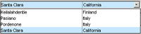
• a modal dialog window that contains a lookup grid reporting a list of codes, or alternatively
• a modal dialog window that contains a tree, where its nodes represent codes to select, or alternatively
• a modal dialog window that contains a tree and a grid, where the selection of a tree node will reload the grid content, i.e. the list of codes (filtered by the selected tree node).
The selected code will automatically reported in the code field.
OpenSwing provides a lookup graphics control, that can be added to a Form object (or used outside a Form, too) and also a lookup column, that can be used in a grid.
|
The lookup graphics control is based on the class org.openswing.swing . client.CodLookupControl , that implements InputControl interface, so that it provides all base properties of any other base graphics control. In addition, lookup graphics control also provides some other properties:
|
|
It offers the same features described for lookup graphics control; this type of column will be further described in "Grid columns" paragraph.
When defining a lookup (both a graphics control and lookup column), you have to connect the lokoup to a lookup controller, through the method:
public final void setLookupController(LookupController controller)
A programmer must create an instance of org.openswing.swing.lookup.client. LookupController class. The tasks of this controller are to validate the code when the code field loses the focus and to retrieve a list of codes when the user clicks on the lookup button.
On validating a code or by selecting a code from the list of codes, the result is the same: a value object (named lookup value object) is stored inside the lookup controller; in the first case the value object is retrieved by the controller as result of code validation; in the second case the value object is retrieved from the list of codes, i.e. the grid containing the list of codes has a grid model composed of a list of lookup value objects.
When creating the lookup controller, a programmer must define the type of value object that the controller has to support, through the method:
public final void setLookupValueObjectClassName(String lookupValueObjectClassName)
When clicking on lookup button, the grid columns construction is automatically performed by the lookup controller, starting from the collection of attributes defined in the lookup value object: for each attribute in the lookup v.o., the controller will create a grid column having a column type compatible to the attribute type. A programmer can define further column properties through setter methods available in the controller and described below.
A controller allows to (optionally) define a mapping between lookup value object's attributes and attributes of the value object stored in the lookup container, i.e. the container on which the lookup is added.
In with way events like code validation or code selection from a list of codes can trigger attributes updating in a grid or in a Form object where the lookup is inserted. For example a programmer may insert a lookup graphics control in a Form and take advantage of the lookup events to fill (or to clean out) other graphics controls in the same Form.
To define a mapping between lookup v.o. attributes and container v.o. attributes, a programmer can invoke many times (one for each attribute to map) the controller method:
public final void addLookup2ParentLink(String lookupAttributeName,String parentAttributeName)
Sometimes it is useful to force code validation without to pass through losting focus on code field; to force a code validation a programmer can invoke the controller method:
public final void forceValidate()
The lookup controller allows to listen every event fired by the lookup, by adding the following lookup listener:
public final void addLookupListener(LookupListener listener)
This method requires to define an implementation for the interface LookupListener, having the following methods:
• public void codeValidated(boolean validated) this callback is called by the lookup when a code has been already validated and returns as argument the validation result
• public void codeChanged(ValueObject parentVO,Collection parentChangedAttributes) this callback is called by the lookup when the code has been changed; the code can change because the user has manually changed it from the code field or because the user has select another code starting from the lookup button
• public void beforeLookupAction(ValueObject parentVO) this callback is called by the lookup before starting validation code operation or before opening the window tha contains the list of codes (i.e. on pressing lookup button); this method is useful to pass any parameter to the business logic binded to the lookup that this logic requires to perform the code validation or to perform the retrieving of the list of codes
• public void forceValidate() this callback is called by the lookup when the validation code operation has been forced.
When defining a lookup, there is another method that a programmer must define:
public final void setLookupDataLocator(LookupDataLocator lookupDataLocator)
through this method a programmer can define the class dedicated to lookup data retrieving, i.e. this class has the task of forwarding a validation code operation and forwarding the retrieval of a list of codes (see "Data retrieval from a lookup" paragraph).
What to do when validating an incorrect code digited in the code field? there are three alternative actions that a lookup can perform:
It is possible to define which action to perform through the "onInvalidCode" property in LookupController class; therefore it is possible to customize the lookup behaviour per single lookup. This property can assume three alternative values:
The default value for "onInvalidCode" property is defined through ClientSettings.ON_INVALID_CODE, so that it is possible to define the default behaviour for all lookups.
A lookup needs to define a class for data retrieval, used to validate code and to retrieve a list of value objects to populate the lookup grid. This class must extends the abstract class org.openswing.swing.lookup.client. LookupDataLocator .
OpenSwing provides a default implementation of this abstract class: org.openswing.swing.lookup.client. LookupServerDataLocator . This implementation forwards data retrieval to server-side classes, remotelly invokoed through ClientUtils.getData method, i.e. an HTTP request is send to a java servlet that will dispatch the request to a specific class dedicated to validation code operation or to retrieve a list of lookup value object to feed the lookup grid. This implementation has been created to work together with the server-side servlet org.openswing.swing.server.Controller (see "Server-side classes" paragraph).
A programmer can define his own implementation of LookupDataLocator interface, to the purpose of contacting server-side logic according to his needs, e.g. via RMI or using SOAP protocol.


