Grid control is based on org.openswing.swing.client.GridControl class. Inside this component a programmer che drop grid columns using the graphical designer of the IDE or by adding columns to the grid control directly on source code; grid columns are defined within org.openswing.swing.table.column.client package.
A grid is always connected to its data model, i.e. the class org.openswing.swing.table.model.client. VOListTableModel that stores inside it a list of value objects, one for each grid row, where each grid column is mapped in exclusive mode to a specific attribute of the value object. Value objects list and grid content are synchronized in real time: a change in a value object is immediately propagated on the grid content and a change applied to a cell in the grid fires an update on the related v.o.'s attribute.
To specifty the value object type supported by the grid, the programmer must call the method:
public final void setValueObjectClassName(String valueObjectClassName)
Data showed in grid can be loaded at all or loaded a page at a time. The vertical scrollbar of the grid can be used to scroll between pages of data, while the cursor of the bar is near the top/bottom ends; it is possible to scroll data pages also through two pagination buttons inside the scrollbar that can be hided/showed though the boolean property ClientSettings.SHOW_PAGINATION_BUTTONS_ON_GRID.
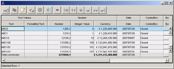
Example of grid content:
|
Optionally a filter/sort panel could be showed at the right margin of the gri, according to ClientSettings.FILTER_PANEL_ON_GRID value. If this setting is set to true, then when the mouse is over the right margin of the grid the filtering/sorting panel is automatically showed. This panel is equivalent to the dialog window opened from the filter button (described below).
OpenSwing supports many types of columns; each column has many properties that customize its usage. Tthere are properties that are common to all column types:
|
In the following figure is showed an example of grid having the additional column headers.
|
The following table reports available column types and a brief description for each of them.
Column type |
Description |
|
Text column |
org.openswing.swing.table.column.client.TextColumn it allows to show/edit text on the column. This column provides additional properties:
|
|
Numeric column integers only |
org.openswing.swing.table.column.client.IntegerColumn show/edit integer numbers only; number is formatted according to internationalization settings. This column provides additional properties:
Optionally a programmer can invoke the method: setDynamicSettings(IntegerColumnSettings dynamicSettings) to dinamically change numeric column properties, for each grid row. |
|
Numeric column decimals allowed |
org.openswing.swing.table.column.client.DecimalColumn show/edit decimal numbers; number is formatted according to internationalization settings. This column provides additional properties:
Optionally a programmer can invoke the method: setDynamicSettings(DecimalColumnSettings dynamicSettings) to dinamically change numeric column properties (or curreny column properties), for each grid row; in this way a programmer can define max number of decimals or the currency symbol, according to his needs, e.g. by showing in the same grid rows having prices expressed with several currencies. |
|
Percentage column |
org.openswing.swing.table.column.client.PercentageColumn show/edit decimal numbers, expressed in percentage format; number is formatted according to internationalization settings. This class extends DecimalColumn, so that it inherits all column properties. |
|
Currency column |
org.openswing.swing.table.column.client.CurrencyColumn show/edit decimal numbers, expressed with a currency format, i.e. with a currency symbol, decimal and thousand symbols; number is formatted according to internationalization settings. This class extends DecimalColumn, so that it inherits all column properties; moreover it has another property: "currencySymbol" that defines the currency symbol. |
|
Date + calendar column |
org.openswing.swing.table.column.client.DateColumn show/edit a date + calendar; the date is formatted according to internationalization settings. |
|
Date + calendar + hour column |
org.openswing.swing.table.column.client.DateTimeColumn show/edit a date + time + calendar; the date and time values are formatted according to internationalization settings. |
|
Hour column |
org.openswing.swing.table.column.client.TimeColumn show/edit a time; the time value is formatted according to internationalization settings. |
|
Lookup column |
org.openswing.swing.table.column.client.CodLookupColumn show a text or number when the cell is not edited and a lookup when the cell is currently in edit. This column provides additional properties:
|
|
Check-box column |
org.openswing.swing.table.column.client.CheckBoxColumn show a text when the cell is not edited and a check-box when the cell is currently in edit. This column provides additional properties:
If the attribute value in the v.o. is null then the check-box is unchecked. If the two properties reported above are not defined, then the check-box assumes that the positive value is Boolean.TRUE and the negative value is Boolean.FALSE. A programmer can listen check-box selection events by registering an ItemListener on the column, through the addItemListener method.
|
|
Button column |
org.openswing.swing.table.column.client.ButtonColumn show a button inside the cell that is enabled only when the cell is currently in edit. As default behaviour, the button shows a " " text within it. This column provides additional properties:
In insert/edit grid mode, the button can be clicked; a programmer can listen click events by registering an ActionListener on the column, through the method addActionListener. Note that it is required to bind the ButtonColumn to an attribute in the v.o.; this attribute usually is of type String (when used to show a text within the button) or of type byte[] or of type Icon/ImageIcon (when used to show an icon within the button).
|
|
Combo-box column |
org.openswing.swing.table.column.client.ComboColumn show a text when the cell is not edited and a combo-box when the cell is currently in edit. This column provides additional properties:
A programmer can listen combo-box item selection events by registering an ItemListener on the column, through the addItemListener method. |
|
Image column |
org.openswing.swing.table.column.client.ImageColumn shows an image related to the attribute of byte[] type contained in the value object of the grid row; when the grid control is in insert/edit mode, then a button may be showed to allow the image selection from local file system. This column provides additional properties:
ImageControl provides a utility method that can be used to listen ActionEvents fired by the selection button: public void addActionListener(ActionListener listener) by means of this method it is possible to capture the event of image selection: the property ActionCommand of ActionEvent argument contains the selected image path. When using an image column, there could be useful to define two properties of grid control, that allow to change grid row heights, according to image heights (that could be fixed or variable):
|
|
FormattedTextColumn | org.openswing.swing.table.column.client.FormattedTextColumn A wrapper of javax.swing.JFormattedTextField. See Swing Javadoc about JFormattedTextField for more information. |
|
Multi line text column |
org.openswing.swing.table.column.client.MultiLineTextColumn it allows to show/edit multi line text on the column. This column provides an additional property: "maxCharacters" maximum number of characters in insert/edit |
|
Multiple type column |
org.openswing.swing.table.column.client.MultipleTypeColumn it allows to show in the same column data having several types, such as text, numeric, date, check-box, combo-box, etc. The attribute associated to this column must be of any type, but usually it should be of type Object, so it can host any data type. Through the column property "typeController" it is possible to define the exact type to use for each cell in the column. This is possible by overriding two methods:
|
|
Progress bar column |
org.openswing.swing.table.column.client.ProgressBarColumn This column provides a read only progress bar; it has several additional properties:
The latter method is used when a programmer has defined some colored bands in the progress bar, through the method: public final boolean addColoredBand(double minValue, double maxValue, Color color) This method adds an interval [minValue,maxValue] and a color to use to paint that interval. |
|
combo box multi-column |
org.openswing.swing.table.column.client.ComboVOColumn
The content of a combo-box column is defined starting from a list of value objects, retrieved through an ItemsDataLocator. More than one v.o. attributes can be mapped as combo item and these attributes can also be mapped to the container v.o. (i.e. the v.o. of the grid or of the Form). This column has several additional properties:
This column provides some mandatory methods that a programmer must invoke:
Moreover, the column allows to specify which combo's v.o. attributes to use to compose an item, through the following methods:
|
|
File column |
org.openswing.swing.table.column.client.FileColumn
This column can contain three widgets: the name of the file, an upload button and a download button. All these widgets are optional and can be hided/showed using the following properties:
|
|
Link column |
org.openswing.swing.table.column.client.LinkColumn This column contains a link, whose text is retrieved starting from "columnName" property and whose URI to show in browser is retrieved starting from "uriAttributeName" property. when user clicks on the link, this will automatically open the browser and set the specified URI on it. This column should never be editable. |
|
Spinner number column |
org.openswing.swing.table.column.client.SpinnerNumberColumn This column contains for each cell a JSpinner for numbers: it accepts a sequence of numbers, fixed an interval, an increment value and an initial value. It is possible to listen for ChangeEvents though the addChangeListener() method. It provides the following properties:
|
|
Spinner list column |
org.openswing.swing.table.column.client.SpinnerListColumn This column contains a JSpinner for a generic enumeration of values: it accepts a Domain object or a Domain identifier. It is possible to listen for ChangeEvents though the addChangeListener() method. It provides the following properties:
|
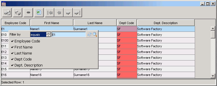
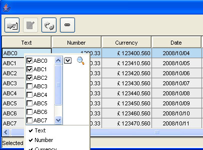
When a grid is in read only mode and the user clicks with the right mouse button on a grid's cell, a popup menu will be showed over the grid; this popup menu contains:
Optionally a search criteria can be defined as an interval, i.e. by specifying a lower and upper value (tipically for numeric or date values).
In this way user can apply filters on the grid in a very quick way.
It is possible to open the popup menu by pressing the combination CTRL+Q; to close it the ESC key can be pressed. To apply a filtering condition it is possible to press the ENTER button inside an input filter field.
|
|
A grid has three operation modes: inserting, editing, read only; this modes are identified by these constants: Consts.INSERT, Consts.EDIT and Consts.READONLY. By means of GridControl.setMode() method a programmer can switch between thse modes. To retrieve current grid mode a method is available: GridControl.getMode() .
When a grid is switched to INSERT mode, a new empty row is added to the grid, at the top of the grid, where cells are enabled if the related columns have "enabledOnInsert" property set to "true". When a new row is added to the grid, a new empty value object is added to the grid data model. As default behaviour, a grid allows to add only one row: the user can only save or reload (undo) that row before adding another one.
It is also possible to define when new rows must be inserted in the grid when it is in insert mode: "insertRowsOnTop" property defines whether new rows must be added at the top or at the bottom o f the grid.
It is possible to insert rows in edit mode too, when "allowInsertInEdit" property is set to "true" : in this case each time the user presses the down key on the last row of the grid, a new row is added at the bottom of the grid. When save button is pressed, GridControoller.updateRecords method is invoked: new rows and changed rows are added to "persistentObjects" argument, oldPersistentObjects list contains null elements for new rows and old value objects for changed rows. In this way a programmer is able to identify which rows must be inserted and which rows must be updated.
When a grid is in insert mode, editing operations are limited to the new row only: user is not able to move cursor to another row and clicking the mouse in another row cause the row selection to be re-set to the new row at the top of the grid. By means of " maxNumberOfRowsOnInsert " property, a grid allows to insert more than one row before saving data. If this property is set to a number greater than 1, then the user is able to move cursor or click with mouse in any new added row. To add new rows (until "maxNumberOfRowsOnInsert" number of rows) the user has to press the "down" key within the last new added row; the grid automatically adds a new row below the last one. To remove the last added row (not yet saved) the user has to press the "up" key: the grid removes the last added row only if it has not been changed yet.
When a grid is switched to EDIT mode, user can move cursor on any row of the grid and all cells related to columns having "enabledOnEdit" property set to "true" are editable. If "editOnSingleRow" grid property is set to "true" then only the current selected row will be editable.
A grid can retrieve data by reading the whole resultset or by reading only a block of data; in the second case, if a grid is in read only mode, when the user scrolls down the grid, the grid will retrieve the next block of data and when the user scrolls up a the grid, the grid will retrieve the previous block of data. If the grid is in insert or edit mode, data retrieval is disabled.
Through the property "autoLoadData" a programmer can define if the grid must automatically retrieve data when it is set to visible.
A grid automatically retrieves data when:
In all these cases the grid control invokes the method:
public Response loadData(int action, int startIndex, Map filteredColumns, ArrayList currentSortedColumns, ArrayList currentSortedVersusColumns, Class valueObjectType, Map otherGridParams)
declared by the interface org.openswing.swing.table.java.GridDataLocator
While defining the grid, a programmer must define also an object of type GridDataLocator, through the grid's method setGridDataLocator .
To retrieve data the grid control invokes loadData method and pass to it some information:
GridParams.PREVIOUS_BLOCK_ACTION, GridParams.NEXT_BLOCK_ACTION and GridParams. LAST_BLOCK_ACTION
"loadData" method requires a return value of type Response; two subclasses of Response are allowed:
OpenSwing provides some default implementations of GridDataLocator interface:
This implementation of GridDataLocator has been created to work together with the server-side servlet org.openswing.swing.server.Controller (see "Server-side classes" chapter).
A programmer is free to define his own implementation of GridDataLocator interface, to contact server-side business logic according to specific requirements, such as via RMI or through SOAP protocol.
E' possibile collegare i bottoni predefiniti (descritti nella sezione "Bottoni") alla griglia, tramite i metodi:
|
A required property that must be set in the grid control is " functionId "; this property defines an identifier associated to the grid that the grid exploits to decide if insert/edit/delete buttons must be enabled or not when the operation mode is changed: the setEnable method of these buttons always checks if the button must be enabled, by verifing authorizations defined in ClientSettings for the specified functionId. In OpenSwing buttons authorizations are defined as a collection of <functionId, related buttons authorizations> and are stored inside ClientSettings object (see buttons authorization section).
A grid must be connected to a grid controller; a programmer must create a grid controller that extends org.openswing.swing.table.client.GridController class. Grid data model, grid and controller compose a tern in M-V-C pattern (Model-View-Controller), where the controller assumes the role of manager of events fired by the other two components, expecially for grid events. To connect the grid to a grid controller, a programmer has to invoke the grid method:
public final void setController(GridController gridController)
Grid controller provides many methods that can be overrided by the programmer::
• public Response insertRecords(int[] rowNumbers, ArrayList newValueObjects) throws Exception this method is automatically invoked when the grid is in insert mode and the user clicks on the save button, i.e. to save data inserted into the grid.
A programmer can override this method to store the list of new value objects passed as arguments to the method. Usually this method acts a data comunication layer, i.e. it does not contain insertion business logic: it contains instructions needed to contact the insertion business logic layer.
This method requires a return value of type Response (see "Response messages" paragraph); two type of Response subclasses are allowed: ErrorResponse if an error occours during saving data operation or a VOListResponse in case of saving correctly completed; VOListResponse object must contain the list of value object inserted; these object may be further filled with other data calculated inside the insertion business logic (such as progressives, creation date/time, etc). The grid control stores this list of v.o. into the data model and update its content.
Note that before calling this method, the grid has already checked all new row's cells to verify their validity state: this insure that the saving operation can be executed starting from a state where all mandatory cells are correctly filled. If validity check has no success, then insertRecords method is not called.
• public Response updateRecords(int[] rowNumbers,ArrayList oldPersistentObjects,ArrayList persistentObjects) this method is automatically invoked when the grid is in edit mode and the user clicks on the save button, i.e. to save data edited into the grid.
A programmer can override this method to store the list of changed value objects passed as arguments to the method. Usually this method acts a data comunication layer, i.e. it does not contain updating business logic: it contains instructions needed to contact the updating business logic layer.
By overriding this method, the programmer could carry on the saving operation by exploiting the list of value objects passed as argument and the same list of value objects not still changed, which were retrieved from the records's read from database before starting to edit the grid; the initial value objects can be useful for example with web applications that are concurrently accessed: before updating a changed record in the database, values from the initial value object will be used to check if the record has been already changed from another client; only if the record is not yet changed, the updating operation is performed.
The method requires as return value a Response object (see response messages paragraph): the programmer must return one of the following objects: ErrorResponse in case of error or a VOListResponse in case of saving correctly completed; VOListResponse object must contain the list of value objects updated; these objects may be further filled with other data calculated inside the updating business logic (such as update date/time, etc). The grid control stores this list of v.o. into the data model and update its content.
Note that before calling this method, the grid has already checked all changed cells to verify their validity state: this insure that the saving operation can be executed starting from a state where all mandatory cells are correctly filled. If validity check has no success, then updateRecors method is not called.
• public Response deleteRecords(ArrayList persistentObjects) throws Exception method automatically invoked by the grid to delete the selected rows (delete button has been pressed) when the grid is in read only mode; the list of value objects stored in data model related to the selected rows is passed as argument. By overriding this method, the programmer could carry on the deleting operation by exploiting the value objects passed as argument.
The method requires as return value a Response object (see response messages paragraph): the programmer must return one of the following objects: ErrorResponse in case of error or VOResponse in case of deleting operation correctly completed; VOResponse object must contain Boolean object, indicating the deleting result.
• public void createValueObject(ValueObject valueObject) throws Exception callback method automatically invoked by the grid when it is switched to insert mode data; the void value object just created and stored in the data model is passed as argument. By overriding this method, the programmer could fill some attribute values of the void value object to the purpose of setting default values in new row's cells.
• public void loadDataCompleted(boolean error) callback method automatically invoked by the grid when data model loading has been completed; data loading can be invoked by means of the reloadData method of the grid object. The reloadData method executes the loading in a separated thread, to the purpose of not blocking the application. By overriding this method, the programmer can intercept the data loading completed event.
A programmer can override this method to insert instructions that start data loading operations for other components, such as grids or panels detail Form/panel of the selected row in grid.
• public void afterReloadGrid() callback method automatically invoked by the grid when data model has been reloaded because the reload button has been pressed.
• public void afterEditGrid(GridControl grid) - callback method automatically invoked by the grid when data updating operation has been correctly completed.
• public void afterInsertGrid(GridControl grid) - callback method automatically invoked by the grid when data inserting operation has been correctly completed.
• public void afterDeleteGrid() - callback method automatically invoked by the grid when data deleting operation has been correctly completed.
• public void modeChanged(int currentMode) callback method automatically invoked by the grid on changing the grid operation mode.
• public boolean beforeEditGrid(GridControl grid) callback method automatically invoked by the grid when the user has clicked on edit button. A programmer can override this method to stop operation mode switching according to custom policies, such as user authorization settings or other checks.
public boolean beforeInsertGrid(GridControl grid) - callback method automatically invoked by the grid when the user has clicked on insert button. A programmer can override this method to stop operation mode switching according to custom policies, such as user authorization settings or other checks.
public boolean beforeDeleteGrid(GridControl grid) - callback method automatically invoked by the grid when the user has clicked on delete button. A programmer can override this method to stop operation mode switching according to custom policies, such as user authorization settings or other checks.
public boolean beforeCopyGrid(GridControl grid) - callback method automatically invoked by the grid when the user has clicked on copy button. A programmer can override this method to stop operation mode switching according to custom policies, such as user authorization settings or other checks.
• public boolean isCellEditable(GridControl grid,int row,String attributeName) callback method automatically invoked for each grid's cell when the grid is in insert or edit mode to know whether the specified cell is editable or not. If this method is not overrided by the programmer, then the grid assumes that all cells of the same column are editable in insert or edit mode according to column properties "editableOnInsert" and "editableOnEdit".
A programmer could override this method to define a more finer custom editability policy, that can be establish editability state for each cell.
• public void rowChanged(int rowNumber) - callback method automatically invoked by the grid when the user selects a row in the grid.
• public void enterButton(int rowNumber,ValueObject persistentObject) - callback method automatically invoked by the grid when the user has pressed the ENTER key. If this method is not overridden then if calles doubleClick() controller method.
public void doubleClick(int rowNumber,ValueObject persistentObject) callback method automatically invoked by the grid when the user double clicks a grid's row. A programmer can override this methods to include instructions that open a window from the selected row, such as a detail window.
• public void selectedCell(int rowNumber, int columnIndex, String attributedName, ValueObject persistentObject) - callback method automatically invoked by the grid when the user selects a cell in the grid.
• public Color getBackgroundColor(int row,String attributedName,Object value) callback method automatically invoked by the grid to retrieve the background color for each grid's cell. A programmer can override this method to specify distinct colors for grid's cells.
If the method is not overridden, then rows are colored alternatively with two different colors: one color is defined through ClientSettings.GRID_CELL_BACKGROUND attribute and the other color is slightly different from the first one, defined through getDeltaColor() method.
By means of setDetailRow() method a programmer can define the number of rows colored with the same value (default value: 1).
• public Color getForegroundColor(int row,String attributedName,Object value) - callback method automatically invoked by the grid to retrieve the foreground color for each grid's cell. A programmer can override this method to specify distinct colors for grid's cells.
If the method is not overridden, then rows are colored with the same color, defined through ClientSettings. GRID_CELL_FOREGROUND attribute.
• public boolean validateCell(int rowNumber,String attributeName,Object oldValue,Object newValue) callback method automatically invoked by the grid when it is in insert or edit mode and a cell has been just changed by the user or from the program. This method requires a boolean return type that represents the validation exit code. A grid stores internally all non valid cells and uses this data to stop saving operation if there exist at least one non valid cell.
A programmer can override this method for two reasons: (i) to intercept a cell value change and perform a logic related to the change (e.g. cleaning out or filling other cells), (ii) validate the cell value, according to some validation logic.
• public Font getFont(int row,String attributeName,Object value,Font defaultFont) callback method automatically invoked by the grid for each cellof the grid to set the font for the text shoed inside the cell; ad default behaviour the method returns null, that means the default font has to be used for all cells.
• public String getHeaderTooltip(String attributeName) callback method automatically invoked by the grid for each column header: it allows to set a distinct tooltip text for a single column header
• public String getCellTooltip(int row,String attributeName) - callback method automatically invoked by the grid for each cell: it allows to define a tooltip text for each grid's cell.
• public Dimension getExportDialogSize(Dimension dialogSize) - callback method invoked by grid before showing exporting dialog and used to redefine the export dialog size
• public String[] getExportingFormats() - callback method invoked by grid before showing exporting dialog and used to redefine dialog size
• public void exportGrid(ExportOptions exportOptions) - callback method invoked by grid when exporting data from grid
It is possible to lock (anchor) rows in grid:
 |
When setting one of these properties, you have to set setTopGridDataLocator or setBottomGridDataLocator method too.
These methods are automatically invoked when the grid model is loaded (i.e. when showing grid, when reloading, after applying filtering/sorting conditions). You have to return a list of value object (of the same type of the rest of the grid); these list must have the same length of the "lockedRowsAtTop" and "lockedRowsAtBottom" property values.
Optionally you could call setTopGridController of setBottomGridController to define other properties or intercept events related only to the top locked rows or bottom loked rows respectively.
Example:
      grid.setBottomGridDataLocator(new GridDataLocator() {

        public Response loadData(
            int action,
            int startIndex,
            Map filteredColumns,
            ArrayList currentSortedColumns,
            ArrayList currentSortedVersusColumns,
            Class valueObjectType,
            Map otherGridParams) {
          ArrayList rows = ...
          return new VOListResponse(rows,false,rows.size());
        }

      });

      grid.setBottomGridController(new GridController() {

        /**
         * Method used to define the background color for each cell of the grid.
         * @param rowNumber selected row index
         * @param attributedName attribute name related to the column currently selected
         * @param value object contained in the selected cell
         * @return background color of the selected cell
         */
        public Color getBackgroundColor(int row,String attributedName,Object value) {
          return new Color(220,220,220);
        }

      });
|
It is possible to update locked rows by accessing that rows throught the GridControl object: internally this object contains 3 "inner" grids: a top grid, the "standard" grid (i.e. the grid whose content is loaded through GriDataLocator std method) and a bottom grid.
The top grid is optional and is showed only if "lockedRowsAtTop" property has a value greater than 0: it shows the top locked rows and has a own data model, accessed through GridControl.getTopTable().getVoListTableModel()
The bottom grid is optional and is showed only if "lockedRowsAtBottom" property has a value greater than 0: it shows the bottom locked rows and has a own data model, accessed through GridControl.getBottomTable().getVoListTableModel()
In this way you are able to dinamically load rows in the "standard" grid and manually set locked rows, at the top or at the bottom of the grid, according to the needs.
GridControl component can include inside it a nested component, one for each row; a row can be expanded in two alternative ways: by showing nested component below it or within it, by replacing row default content.
It is possible to define which row are (not) expandable. Expandable rows contain a special "expansion symbol", the same showed near nodes in tree component; by clicking on this symbol a row can be expanded. An already expanded row can be collapsed by clicking on the same symbol. That symbol is always showed inside one of the visible columns of the grid: a programmer can define which column has to contain that symbol; nested component is showed starting from the expanded column until the right margin of the container grid.
A cell can be expanded/collapsed using key accelerators too: CTRL+P and CTRL+L to expand/collapse selected row. These key accelerators can be customized using ClientSettings properties EXPAND_CELL_KEY and COLLAPSE_CELL_KEY.
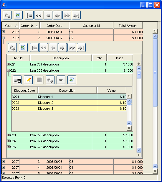 |
Nested component can be any graphical object (that derives from JComponent). For instance a hierarchy of grids can be created, composed of any number of nested grid components; for instance a main grid can be used to show orders and, by expanding one order, an inner grid can be included to show order rows; a specific order row can be expanded in order to show a third grid, reporting row discounts.
Grid editability is also supported for nested grids and also for nested Form panels.
To enable the usage of nested components inside a grid, there are some properties to set in GridControl component:
"Demo40" sample application shows how to create nested grids.
org.openswing.swing.pivottable.client package contains PivotTable component. This component allows to analyze a matrix of values, by grouping them by hierarchical data, defined per row and per column. Any number of row fields and column fields can be defined and data is then aggregated according to those row/column groups of fields.
Data can be read through a reader; OpenSwing provided several readers: a CSV file reader, a TableModel reader and a Value Objects list reader; available readers are located in org.openswing.swing.pivottable.tablemodelreaders.server package.
For each row and column field an aggregation function must be defined; OpenSwing provides several aggregation functions: identity, year, quarter, half year, word's initial character; available aggregation functions are located in org.openswing.swing.pivottable.aggregators.java package. Moreover, OpenSwing allows to define any other kind of aggregation functions, by extending base class: org.openswing.swing.pivottable.aggregators.java.GenericAggregator.
For each data field to elaborate, several functions are available: sum, count, average, max, min; available functions for data fields are located in org.openswing.swing.pivottable.functions.java package. Moreover, OpenSwing allows to define any other kind of data field function, by extending base class: org.openswing.swing.pivottable.functions.java.GenericFunction.
 |
Pivot table feature provided by OpenSwing strongly decouples presentation from data analysis task: data reading is performed using some kind of reader, data "compilation" is launched by PivotTable view and executed by org.openswing.swing.pivottable.Server.PivotTableEngine that is indirectly invoked using org.openswing.swing.pivottable.client.PivotTableController class whose task is to forward PivotTable request for data to PivotTableEngine. In this way, in case of three tier client-server applications, it is possible to perfom the heavy data analysis task on PivotTableEngine onto the server-side layer (on a powerful server machine) and showing data on PivotTable panel, located in the client-side machine.
Optionally, it is possible to bind ExportButton to PivotTable panel: in this way the current content of PivotTable can be exported in xls format. A popup menu is available in PivotTable main table, by right clicking with the mouse: popup menu provides commands to expand/collapse the whole content of the grid.
Optionally, it is possible to bind ReloadButton to PivotTable panel: in this way the current content of PivotTable can be refreshed, by calling "compile" method again.
Optionally, it is possible to bind FilterButton to PivotTable panel: in this way a PivotTable settings dialog is showed, in order to define which fields use as row/column/data fields. Their usage order can be defined by drag 'n drop fields in the grid included in "Pivot table settings" dialog. It is possible to remove row/column/data fields also by double clicking them directly in the PivotTable.
Row/column/data fields can be defined using classes located in org.openswing.swing.pivottable.java: RowField, ColumnField, DataField.
Sample application named "demo49" shows how to create such kind of pivot table.

